
All you need to know about Mid-century (1950s–1960s) German Pilsner beer bottle labels.
German Pilsner beer bottle labels follow long‑standing design traditions, resulting in labels that are clean and minimalistic, reflecting German brewing precision, freshness and purity. A combination of typography, crests, and colour cues, ooze heritage, class and style.
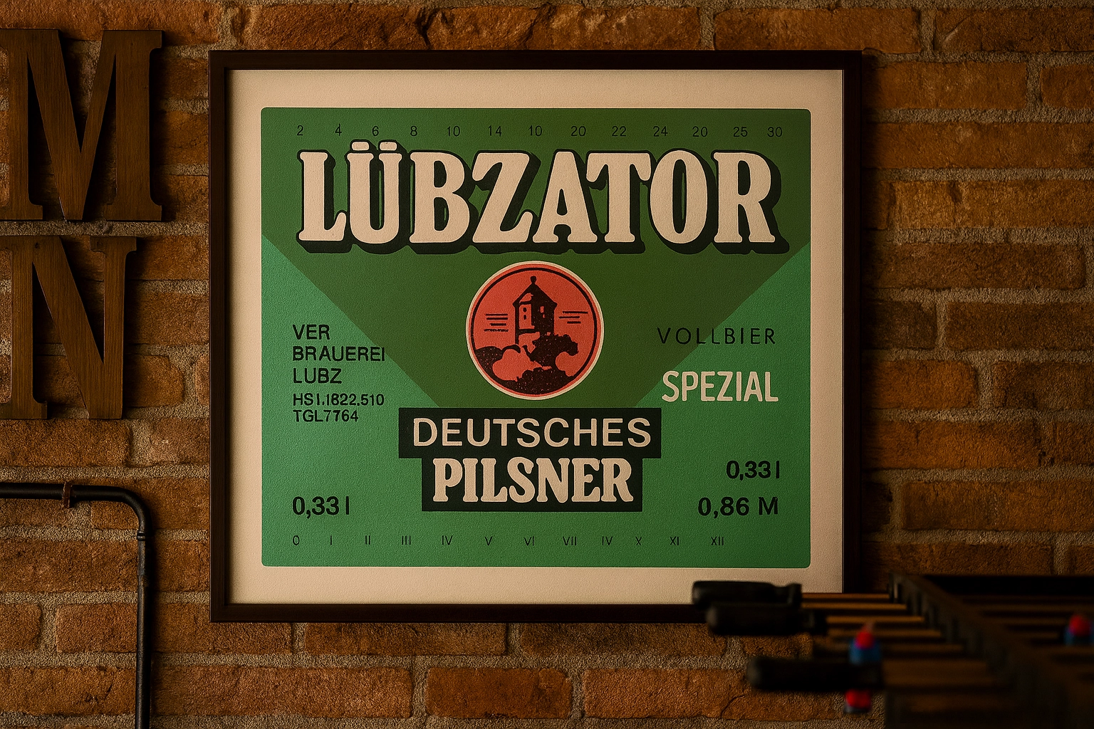
1. Heraldry was central. Most labels featured crests, coats of arms, or regional emblems (knights, lions, anchors) to signal origin and tradition, long before modern branding norms.
2. Reinheitsgebot claims appeared widely. From the early 1950s, labels began explicitly referencing the 1516 Beer Purity Law as a trusted quality mark.
3. Green glass dominated. Brands like Jever, Beck’s, and Holsten used signature green bottles, so labels were designed to contrast vividly against dark green glass.
4. Blackletter typography lingered. "Pils" or "Pilsener" was often set in traditional Gothic/Fraktur fonts, a deliberate link to pre-war heritage.
5. Gold foil was a premium marker. Higher-end Pilsners used gold embossing or metallic inks for borders, crests, or brand names to suggest quality.

6. Minimal ingredient text. Strict adherence to purity laws meant short ingredient lists: just water, barley malt, hops, and later yeast.
7. Deposit system marks. Labels included small "Pfand" symbols or numbers because bottles were reused dozens of times in Germany’s returnable system.
8. Regional identity front and center. Labels named specific cities or regions (Bremen, Jever, Radeberg) to distinguish local provenance from generic Pilsners.
9. Post-war streamlined shift. Mid-century designs softened elaborate Victorian flourishes into cleaner, symmetrical layouts, though core crests stayed unchanged.
10. Export variants differed. Labels for international markets often added English text, bolder brand names, and simplified crests for foreign readability.